- Not My Job
- Posts
- Hey, your landing page has halitosis 🤢
Hey, your landing page has halitosis 🤢
Your step-by-step guide for fixing a landing page that just won't sell because it has sales breath
Sophia O'Neal & Aelia Haider
August 07, 2025
I freaking love Harry Dry(‘s work).
Seriously, if you have followed me around the internet at all in the last 4 years i have thrown, linked, referenced and practically HURLED Harry’s Landing Page copywriting guide at every SaaS founder i could find who was trying to DIY their site.
Me, preparing to —send it—
Thing is.
Harry’s guide (have i mentioned how great it is?) is written for marketers.
For us who know what CTA stands for, and the difference between ‘phrasing’ and ‘messaging’.
Landing pages are where people meet your product, so if everything else leading up to your lander is set up correctly but you’re still not hearing the sweet Stripe pings of a conversion…
Yep, yep, “We’ve found the problem Houston.”
But AI can’t solve this problem for you (sorry), especially if you don’t understand the structure of what you need in a landing page.
That structure is what Harry’s guide nailed and why i love it.
So in today’s issue - how to fix your “above the fold” copy (the opening section of your site) so people don’t read it and bounce.
Using the framework of Harry Dry:
Explain the value you provide (title)
Explain how you'll create it (subtitle)
Let the user visualize it (visual)
Make it believable (social proof)
Make taking the next step easy (CTA)
And super clear how-to’s for each part that won’t make you cry.
With real examples from other boostrapped (or close to it) SaaS co’s.
And one bootstrapped marketing agency 😉.

You got this!
Let’s get started with…Customer research!
I know, customer research, what a shock! (hehehe)
Think of customer research as the protein shake for your landing page copy workout.
Gives you the fuel to power through.
Read the notes from calls with your best-fit customers.
Find the real words customers used. Look for their problems, what they liked, and times they really 'got' your product (the aha! moment).
Note any worries or issues they had when buying or using it. (those are objections you’ll address later down on the page)
Make notes on anything you want to change later.
If you do this, half your work is already done.
Your customers should be the ones doing most of the work writing your copy.
You’re really just tweaking what they’re saying.
You can put all of this info into this Messaging Matrix (Notion template version, or Google Sheet version).

Here’s what the table looks like
Step 1: Explain the value you provide (Title/H1/Header)
Go through your interviews and transcripts with customers - what is the most-commonly repeated description of the relief of having your product work for them?
What are they saying in their head as they approach yet another product-in-a-crowded-field (CRM’s, I’m looking at you!).
There it is. There’s your title.
Yes, it can be weird or unexpected - the goal is for them to stay on the page long enough to keep reading (that’s what the subtitle is going to do!).
But usually it’s real simple.
Here’s one we did for Image Charts, a chart creation tool:
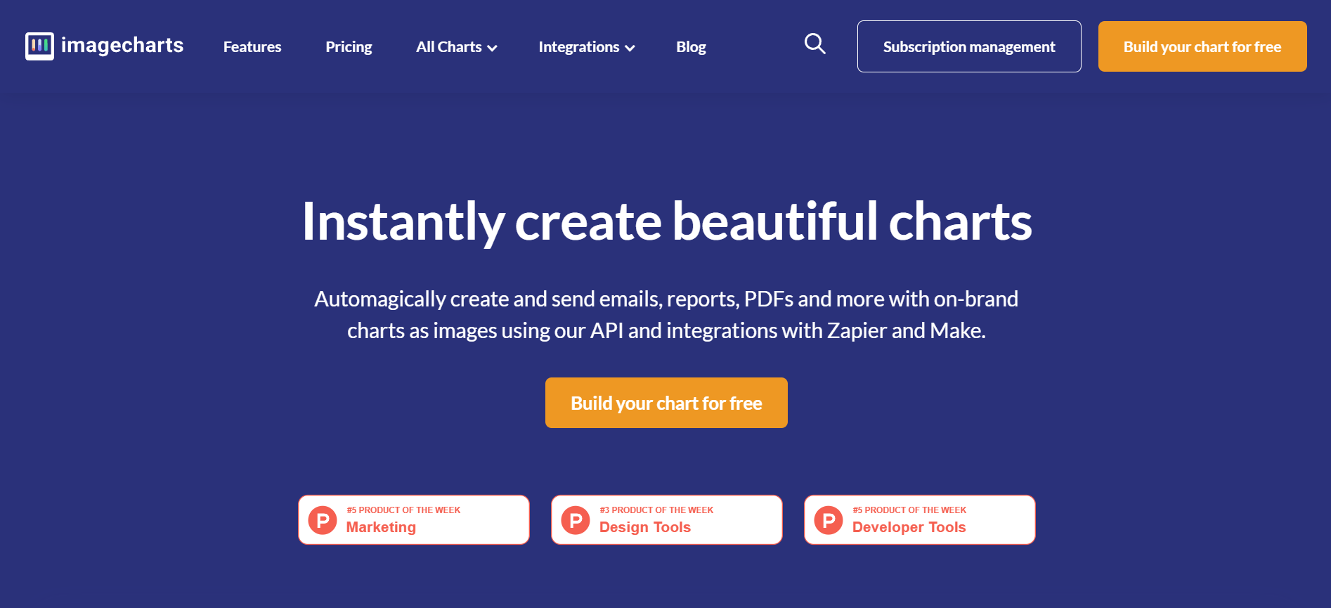
Boom, that’s simple.
Yeah yeah, cool, but “I’m not like those other companies and this isn’t going to work for me because…”
…I have like 15 use cases and i’m not sure who my target audience even is
Then go through those interviews and find the throughline → what is the one thing that all of those use cases have in common.
Yes, this is the part you can use ChatGPT for and a prompt to help.
Always be polite so that your grandchildren will be spared. (jk, not jk)
🤖 Throughline-finding Prompt:
“Hi! here are the transcripts (or emails) of my last 5 calls with customers that i would like to get more of. Could you please pull their descriptions of the value or benefit (emotional, tangible, or intangible) that my product/service gives them
Do not summarize the benefits and give me the direct quotes with time stamps, grouped by benefit type and common traits.
Please note which type of benefit seems to come up the most
“ transcript 1”
“ transcript 2”
“ transcript 3”
“ transcript 4”
“ transcript 5” “
Just make sure to remove all identifying information like emails and customer ID’s before you paste in the transcripts! Safety first!
Gumroad (platform for selling digital products for creators) nails this.
There are probably 15,000 different kinds of creators on the platform, but the biggest value they provide is helping someone sell for the first time.
And if you look at their reviews, most of them mention this.
“You helped me make my first dollar online” comes up verbatim.

…I don’t have any customer interviews yet
Then get your cute booty to Reddit.
Use GummySearch to create an audience using keywords and benefits
Hit the forums and stalk observe. Note what the user pain points are
If you see patterns of complaints/discussion points, track those keywords in GummySearch to keep an eye on those conversations
Use the “Ask” feature to see what people have answered in Reddit posts regarding a specific use case
Here’s a video on how to use GummySearch ⤵️
Also, start talking to people who want to pay you!
I wrote a whole guide with Abhishek on how to do just that (even when you’re scared to talk to people)!
Step 2: Explain how you'll create it (Subtitle/Description)
If there’s one part i’m gonna get a little technical about, it’s your subtitle.
(don’t panik, it’s not difficult, just technical!).
Your subtitle is the crystal, key-word-clear, explainer of how that fantastic thing you promised in the Headline.
It should be 3 parts, ideally separated with commas:
How your product works to solve the customer’s problem (in plain terms)
Another way your product works to solve the customer’s problem (in plain terms)
An answer to their biggest objection (aka your answer to “Okay this is cool, but sounds too good to be true”)
Example: DropEvent (photo collection tool for weddings and special events)

How your product works - defined “anyone” from the headline
→ “Friends, families, acquaintances, or a group of strangers.”
Another way your product works - by explaining what it isn’t (combo of features/benefits and objection answering)
→ “No apps to download, no guest sign-ups, no limits.”
An answer to (one of) their biggest objections - and defines “limits” from the previous line
→ “Upload as many photos as you want at their original quality.”
The first two lines could be cut into one, but this rewrite from the original site dropped the homepage bounce rate by 30% in a month.
Bibbity, bobbity, boop! 🪄
Step 3: Let the user visualize it (Value Add Visual)
I call this the Value Add Visual → because it should add value or it shouldn’t be there.
Ask:
“What is the simplest, most “duh” way to show how the feature customers love the most works to solve the problem they signed up to solve”?
OR
“what is the feature that makes them go “Ah ha!”
Annotated static screenshots work.
Cleanshot gifs work great for this.
Or, you can get all fancy with a Supademo or Arcade.
Example: DropEvent (again)
The photo is exactly what a gallery looks like for a user and what it looks like to setup an event.
The options shown in the screenshot further de-risk the tool and answer, instead of talk about, a lot of other objections a users might have (how will the photos show up, what are the privacy settings, can I manage what photos get uploaded, etc, etc).
It also showcases the image quality point from the subheader → “original quality”
Look at the lovely (obviously real) couple!
There are A LOT of ways you can collect and show social proof.
Here’s how to do it without the eye-glazing line of logos (nobody caressssss).
Screenshot a direct quote or review from a user → this can also be your Value Add Visual!
Borrow it from an authority figure → namedrop the recognized brilliance behind your unknown product
Show a usage or satisfaction metric → this is my favorite method and a see it the least and i don’t know why! It is completely unique to your company
Here’s a bunch of examples of what it can look like - specifically the metric bits. Specific, odd numbers work best. Leave your rounding for your accounting figures.

The screenshotted review one is hard to read, but highlights work wonders for drawing the eye.
Also, gotta rep my friends at Senja, they do make it real real easy to collect the proof.
Step 5: Make taking the next step easy (CTA)
You did all this work to get people to click a button.
Now the button has tell them it’s worth clicking.

Gahhhh.
Here’s how to write it:
Use a clear action verb - Think about what action you want the user to take next (like "Start" or "Download").
To give your customer The One Thing They Want - Go to the messaging matrix if you don’t remember!
Tell them why they shouldn’t side-eye you if the click - telling them that it’s free (if it is) or that it won’t take much time (if it doesn’t) or that you won’t sell their soul (you better not) are the most common for a reason.
Should be 5 words or less so it fits on the button with ease.
Example: Image Charts (again)

CTA: Build Your Chart for Free:
Clear action verb: “Build”
tells you exactly what will happen when you click it: “your chart”)
and clearly addressing an objection: “for free”.
You did it.
You just fixed the first part of your landing page. 🥂
This approach works so well i’ve barely touched my landing page copy in 4 years
I wrote the copy for our website for Ignore No More (the no-nonsense SaaS Marketing agency that’s sending this email your way) four years ago and almost every lead i talk to references it as one of the reasons they’re on the call with me.
It still hits.

⚡️ Headline: The fear of messing up marketing and it costing them their company is the marketing fear that came through in every. single. one. of the customer interviews i did with founders when i started INM (still does).
⚡️ Subtitle:
How the fear-less marketing works “unignoreable” “message”
An answer to their biggest objection “How much is this gonna cost? Can I afford it?”
Based on our analytics data, the pricing page is most commonly clicked after home for a reason.
⚡️ CTA: A bit different because it’s services, not product, but talking is the next step to us working together, so that’s what i want a site visitor to do next.
But you know what’s missing here?
The Value Add Visual - that cutesy illustration is doing nothing
Social proof - it’s wayyy too far down on the page and i need to fix that
Fun fact: I hired an illustrator 3 years ago to create a darling custom illustration for the site, and it’s still not up.
This is my promise that it will be by the time we get to the next issue.
Along with some of our fabulous eye-popping (instead of eye-glazing) social proof.
Pinky promise.
New here? Hello! 👋🏽
I’m Sophia and I run Ignore No More, a SaaS marketing agency that helps get your marketing unstuck and moving for small-team SaaS co’s.
We’re for you if:
you’ve gone through 3-5 marketers and nothing’s working 🤦🏽♂️
you’ve tried (and failed) at paid and have no other marketing ideas 😬
you’re not sure how to get more of the great customers you’ve already got 🥺
Through customer research, websites that convert, and marketing execution (+ strategy!).
If you need help choosing marketing channels, we should talk.
Here’s my Cal link.

You + Ignore No More killing your new landing page
so you can make more money
Not you, but you know someone in this spot?
Refer us to a friend who doesn’t want to do marketing. we’re taking new clients for April for Customer Research, Websites, and Marketing Strategy!
A DM with “I heard you were looking for help with [blank], consider hiring Sophia” is highest praise!
See you in your inbox next week, where we’ll cover how to write the rest of your landing page!
Sophia 💜👩🏽💻 & Aelia ⚡️🧕
Powered by last-minute decisions ⏲️ while also excitedly looking forward to the US Open 🎾
Reply