- Not My Job
- Posts
- I think you forgot to floss 🪥
I think you forgot to floss 🪥
Part 2 of how to fix a landing page with sales breath - from features to founder story
Sophia O'Neal & Aelia Haider
August 14, 2025
Well helloooo my pretties.
Where i last left you, you were hanging by your tenterhooks hoping for details on how to write the rest of your landing page after we discussed how to write the “above the fold” → aka what
Can’t. hold. on. much. longer!!!

Yes, i can still sing the theme song.
the wait ends now.
In case this is your first shindig (welcome!) Part 1 lives here.
Now, on to the rest of the landing page story!
Make the value concrete (features and objections)
Bring to life your offer (social proof)
Tie up loose ends (FAQ)
Repeat your call to action (2nd CTA)
Make yourself memorable (Founder's note)
There are some notable additions to Harry Dry’s framework i’d like to make here, especially if your website is just one page (for now).
Step 6. Make the value concrete (features and objections)
This is the section that is most likely to turn into an feature dump or a vague “about us” section if you’re not careful.
So here’s the steps to avoid such foolishness:
Check your above-the-fold copy (which is based on customer research, remember!) and match what you said your product could do (benefits) to the product capabilities that actually do them (features). List them.
Go to your messaging matrix. Check the pain points, underlying problems, and biggest objection rows and list down what’s mentioned the most.
Match each benefits/features with the pain point and objections
Honestly - this is something i would use ChatGPT for if you’re not a copywriter.
Try these two prompts:
hey Chat, here is a list of my products benefits, features that correspond to those benefits, and my customers biggest pain points that lead them to look for a product like mine, and their biggest objections around purchasing a product like mine.
Please group by benefit-feature matching (the features that support that outcome)
Under each benefit-feature group, please list out the pain points that would make them look for this product and the objections they would need answered to be willing to buy.
Once you have those groupings, write each feature section like this:
Headline (H2): “Pain point + solution”
Subheader (description):
line 1) explicitly explain the feature that fixes the problem
lines 2-4) answer the objections they have around
CTA: this is optional, usually people are just information gathering in your features section, so asking them to buy in a little premature.
Exception is if you’re answering an objection with detailed documentation that’s better linked out to.
Yes, “3 is a magic number” for feature sections
BUT If you’re product is:
for people who are not super techy (plumbing, construction, energy)
for products that have A LOT of features they need to compete on (crowded industries like CRM or productivity apps)
in a complicated industry with a lot of “but’s”, like law, finance, or healthcare
You might want to try 5 feature sections. (aka L-R-L-R-L).
Especially if you just have a one-page site for now.
And if you’re testing out your marketing and target audience and need a professional site built, a one-pager is cheaper and easier to get right than a 5-15 page site.
Here’s an example of how this works in the real world for a past client of ours. 🧸
This is the above-the-fold snapshot from focus bear, a productivity app for neurodivergent people.

Notice their promises:
focus
productivity
punctuality
peace
And this is their feature section below-the-fold that showcases those promises in specific terms:
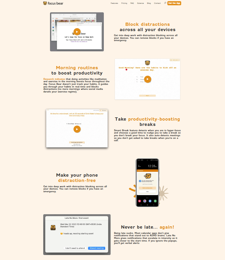
The first feature section uses this framework almost to a “T”
H2: “Block distractions across all of your devices” (feature + benefit)
Description: “Get into deep work with distraction blocking across all your devices. You can remove blocks if you have an emergency.” (second line answers an objection)
Also big note - the images and screenshots show exactly what they’re describing.
No “fluff” images in sight.
If you don’t have pretty demo images, make some with:
Supademo
Video Screenshot (literally Command + Shift + 5 on mac)
Loom
or if you have a mobile app
Screen record (on iPhone - i’m sure Android has it too)
If you want to get fancy you can mark them up in Canva or video editor of your choice.
And convert to gifs so that they replay on the site without the page having to reload.
Boom. Value-add-visual, DONE!
Last week I talked about top 3 ways you can show social proof without an eye-glazing line of logos (nobody caressssss).
Screenshot a direct quote or review from a user → this can also be your Value Add Visual!
Borrow it from an authority figure → namedrop the recognized brilliance behind your unknown product
Show a usage or satisfaction metric → my favorite and least-used way
Above the fold you want to make your social proof a cute one-liner that you can fit under the subheader.
Below the fold you have more space.
And if you have more than 5 reviews
And 35-50 (min) users you can aggregate data from
Then use the metrics as a headline, give a description on what it means (if necessary) and put your testimonials below.
A word on testimonials, because i see these get out of hand a lot
if you have just a few testimonials - put up the top 1-2
if you have a fair amount (15-30) - limit yourself to the top 12 and put a “click for more” button below those 12 so people aren’t scrolling forever
if you have a lot (35-50+) consider using tabs to break up groups of reviews by use case, industry, or tier (freemium, SMB, enterprise)
And for the love of organization - have a single source of truth for your reviews!
Senja is great for this.
(full disclosure, i am an affiliate, but i’ve used it long before i got paid).
But if you want to go ✨ free.99 ✨
Use a Google Drive folder with screenshots and name the file
“Reviewer’s name.company.industry.APPROVED”
“Reviewer’s name.company.industry.WAITING ON APPROVAL”
“Reviewer’s name.company.industry.NOT APPROVED”
Even ones that aren’t approved for public use can be great for copy bits.
Here’s some visuals on how that can look
Metrics + a few standout quotes (Gumroad)

Real words from real customers, typical “Wall of Love” (Image Charts):

This is built with Senja btw.
And if you want to showcase just one magnificent quote that hits all the highpoints, use highlights - and a cute (or on-brand) graphic (PostHog)

No, they did not build this in Canva. Yes, you probably could build something similar in Canva.
8. Tie up loose ends (FAQ)
What’s all the questions people ask you in sales calls that are dealbreakers?
Or are sticking points you get asked in support (that you’re SURE you answered in the onboarding) before someone hits their “aha!” moment?
Here’s the time to “Nip it in the bud, Andy”.
If you’re stumped on what to put, here’s 5 questions you should definitely answer in this section.
What does this integrate with?
Will i need any new skills to make this work?
How long does it take to make this work for me?
Have you worked with [my use case/industry] before?
(if you have a free plan) What does “free” really mean? What’s the catch?
9. Repeat your call to action (2nd CTA)
It’s button time! Same as with social proof, you have more space here, so it’s a standalone section.
Headline (H2): “this is undeniable proof for why our product is AWESOME in the eyes of our customers”
Subheader: “talk about your customers and the specific reasons that they love your product”
CTA: tell the user what to do next “try [solving your problem] now”
If you have a funny line from a customer review, like “If you’re not using this, you’re sorely mistook” use that as your header. Use their reasons for “Why you’d be mistook” to buy as the subheader.
A note on CTA’s - the best go one of two ways
clear and straight to the point in 5 words or less “Get started in 5 minutes”
cheeky and clever “Stop running in circles with your cashflow and try [product name]”
Go with whichever fits your brand and amount of customer research you can pull from.
Cheeky and clever has to sound authentic to the brand voice and the customer or it comes off forced.
And now, drumroll please… 🥁
My favorite CTA example of all time - PostHog being abso-fricking cheeky and retro all at once.
And note that subtle social proof with the G2 badge? Perfection i tell you!

10. Make yourself memorable (founder's note)
As tech writing is quite literally being flattened into robot slop, nothing makes a product stand out like a tone of voice, an opinion, a proof there’s a real human behind the tech.
If you’re worried putting your face on the site that it will cost you Enterprise deals, don’t. (Unless you sell exclusively to Enterprise → that’s not my wheelhouse, i recuse myself.)
If the software slaps (and you’re willing to go through Enterprise deal purgatory) the software slaps.
Tell your story like this: start right before you almost got eaten by the bear.
Terrible thing that gave me the idea
I decided there was a better way
And now here we are (brag a bit if you like!)
Try the thing if you’re like me (but be nice and not sales-y about it, very conversational, warm, and appreciative!)
Signature (preferably, your real one or close to it)
Here’s one from DropEvent (which had many an Enterprise customer!) - complete with his original drawing.

If you have a one-page site, here are some other things to add
Pricing
Make it simple, clear, and either one plan or three.
If you’re still figuring out your target audience/persona/ICP/whatever acronym you wanna put here, these are the rough CTA’s to stick with:
Free/free trial plan: “try now” → links to login (CC optional, that’s for a longer discussion)
SMB plan: “Try now” → takes you straight to CC land
Unlimited/Enterprise plan: “let’s talk” → link to your Cal
Now’s not the time to get “fancy”.
The money shouldn’t be funny and the change shouldn’t be strange.
Use cases/Industries
If your product can be used for many things or in multiple contexts, say that!
Better yet, show it.
Galleries of existing projects with your tools
a table of logos with exactly how the team used it and the results
a little list (UI of catty-cornered boxes i’ve found works well for this) of how the product works for different use cases,
bolded text “for [use case] with [problem]
description text underneath it “[product name] [solves this problem for this use case this way]
And a final note: If your audience is tired of games, break all the rules.
Basecamp’s landing page follows the spirit (and none of the law) of Harry Dry’s guide.
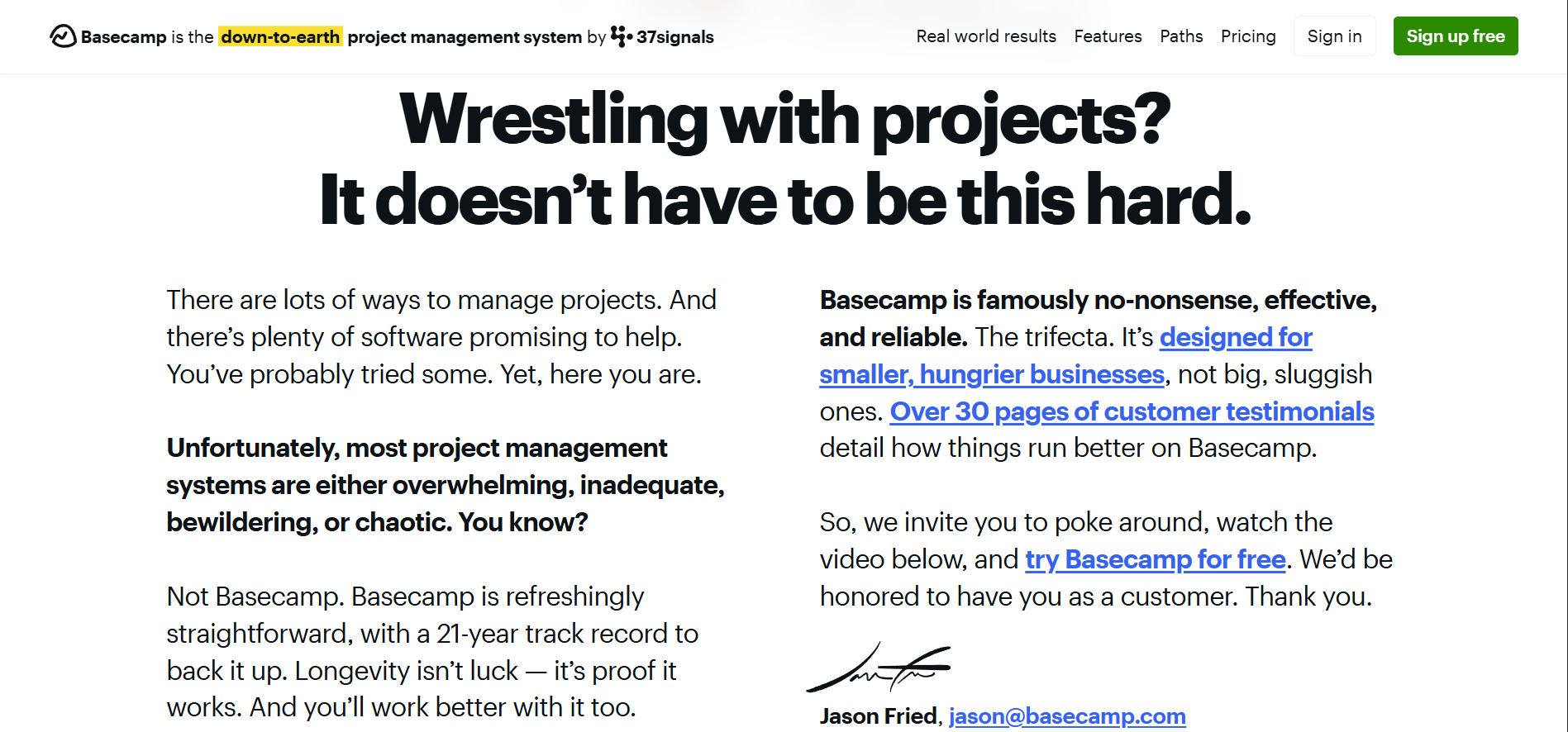
It still works.
Why?
Because it has every. single. piece. of a killer full-page landing page in the above the fold alone.

It’s also in an industry with so many competitors (project management software) that another list of features and traditional landing page formatting would make a site visitors' eyes glaze over.
If you’re in a really crowded industry, do something drastic and dramatic on your landing page.
Like write a letter to your future customers.
The worst that could happen is you get ignored (and if your landing page doesn’t shake them from their comparison stupor, that was gonna happen anyway).
Feel like writing a landing page is a lot of work and you’d rather someone else did it?
Lucky you, we do websites from copy to design to dev (and all the marketing before and after!).
New here and wondering who “we” are? 👋🏽
Hi! I’m Sophia and I run Ignore No More, a SaaS marketing agency that helps get your marketing unstuck and moving for small-team SaaS co’s.
We’re for you if:
you’ve gone through 3-5 marketers and nothing’s working 🤦🏽♂️
you’ve tried (and failed) at paid and have no other marketing ideas 😬
you’re not sure how to get more of the great customers you’ve already got 🥺
Through customer research, websites that convert, and marketing execution (+ strategy!).
If you need help choosing marketing channels, we should talk.
Here’s my Cal link.
Not you, but you know someone in this spot?
Refer us to a friend who doesn’t want to do marketing. we’re taking new clients for April for Customer Research, Websites, and Marketing Strategy!
A DM with “I heard you were looking for help with [blank], consider hiring Sophia” is highest praise!
We’ll see you in your inbox next week!
Sophia 💜👩🏽💻 & Aelia ⚡️🧕
Powered by a Gilmore Girls level of Chinese takeout 🥡 & Going OOO for Pakistan Independence Day 🇵🇰
Reply